
As the famous saying goes, good UI design is like a ninja – stealthily hiding in the shadows, only drawing attention to itself when something goes wrong. This near-invisibility is exactly what sets effective UI design apart, allowing users to work uninterrupted.
But how do you achieve this seamless user experience? What makes some mobile designs stand out from the rest?
Here in this article, we’ll uncover the golden rules that define good UI design, making it both functional and consistent no matter how diverse the projects are.
But first, let’s start with the base!
User experience designers are often told to create an intuitive and easy to use interface for an app or a website. But what does that even mean? And more importantly, how do you achieve it? Don’t worry, we’ve got you covered.
Let’s delve into the secrets of designing a user interface that’s so user-friendly, your grandma could use it.
What is an Intuitive User Interface?
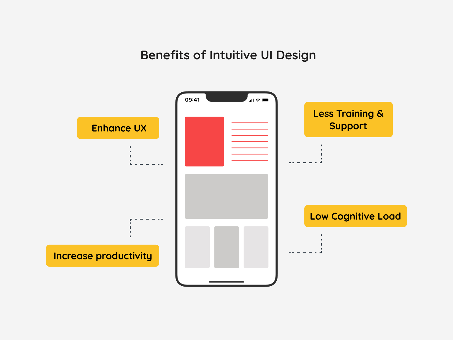
An Intuitive User Interface is like a GPS directing you without letting you feel lost or confused. No need to guess, experiment, read manuals, or ask for help – it’s an user-friendly UI that seems to almost read your mind!
Designing an intuitive interface is a complex endeavor that necessitates a thorough grasp of user expectations. An intuitive interface operates seamlessly, aligning with user anticipations without necessitating conscious thought. When interacting with software, users typically approach with a clear objective and prefer not to expend extra cognitive energy on navigating the interface.
The less we have to interact with the interface, the more we can focus on the task at hand. In the software world, this concept is known as cognitive load- the mental effort needed to complete a task. If an interface is intuitive, it has a low cognitive load, which translates into efficient work and high-quality output.
But the benefits of an intuitive interface go beyond just efficiency. Users require less training and support because they don’t have to learn how to use it. So, an intuitive interface not only makes life easier for users, but it also saves time and resources for companies.
Now, the next question that would come to your mind must be – How to create an intuitive interface?
Let’s explore some innovative and exciting ways to understand this question.
How to Create Intuitive UI Designs?
Creating an intuitive interface can be not only a design puzzle, but an understanding of our users and their mental models. After all, what seems intuitive to you might be unclear to someone else.
Much like a gown or suit, interfaces must fit like a glove. To achieve this, UX designers must use research, feedback and prototypes, aiming to understand a user’s mental model so they can tailor their approach accordingly.
Your mental model is an internal representation of your experiences and beliefs. When a design aligns with your mental model, everything seems to “click” into place.
So, when dealing with user prompts, it’s important to consider common concepts that a user might encounter, as well as scripts that define their expectations in certain situations. With this in mind, we can create interfaces that work for all users.
Design is all about striking a balance between form and function. Making your next project a hit requires getting the fundamentals right.
So to give you a head start in your design journey, here are 7 principles that you need to know. But first, let’s start with an understanding of what exactly are design principles.
Let’s dive in!
What are UI Design Principles?
UI design principles are the backbone of a successful user interface experience. They guide designers in creating interfaces that feel fluid and intuitive to navigate, sparking joy for the user.
By prioritizing clean visuals and logical menu patterns, a designer can create an interface that feels almost effortless to use.
Now, let’s move on to the design principles.
7 Key Principles for Designing Intuitive Interfaces
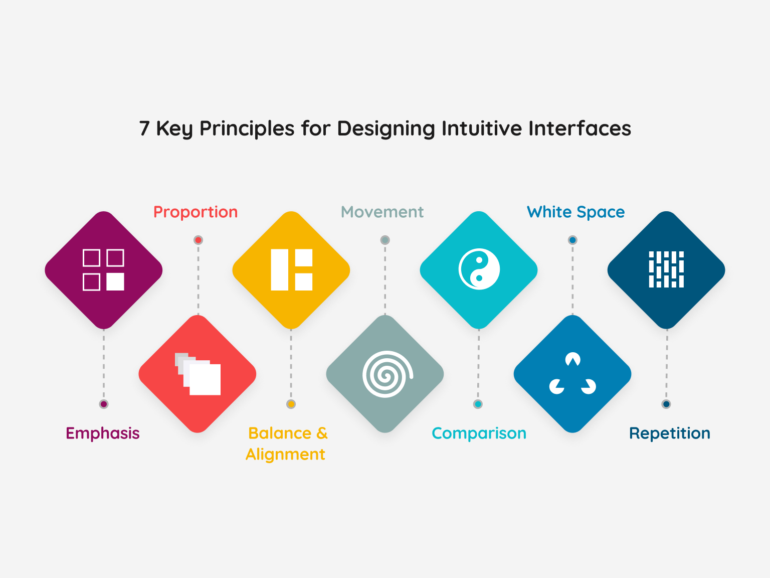
Principle of Emphasis
When designing a business workshop poster for email or any other channels, remember the first of the 7 design principles: emphasis. This defines the focus and importance of each element in your design. So, before you start, ask yourself: What is the key information my audience needs? Is it the date, location, or cost of attendance?
Once you’re clear on this, make a mental outline and let your creative juices flow. Brainstorm ideas and lay out your design in a way that’s well-ordered and visually pleasing. For example, if the workshop name is the most important information, give it prominence in the poster. Play with color theory to create a solid, eye-catching palette that shines the spotlight on the key details.
But remember, just like writing, design requires structure and planning. Starting without a clear idea of what you want to convey will only result in a failed design. So, grab a drink and let the ideas flow before putting pen to paper!
Principle of Balance and Alignment
When it comes to user design, every element you put on the page matters. But, did you know that these important elements have weight?
Here’s the lowdown: weight is determined by color, size, and texture, and cramming all the heavy icons into one corner of the page is a big no-no. So, what’s the solution? Moderation. Without it, your users will feel like their eye is about to pop out of its socket.
To strike a balance, use the measurement design technique. It creates symmetry by using features of equal weight and aligning them with both sides of the middle line. On the other hand, asymmetrical design uses contrasting weights to create an uneven yet uniform look. It’s a bold approach that’s sure to grab the user’s attention and create movement in your design.
All in all, design is all about balance. Whether you go with symmetrical or asymmetrical, both can be expertly crafted to create movement and interest in viewing.
Principle of Comparison
Design “emerges” through comparisons that stay etched in your memory long after you’ve observed it. The key to making your design impactful is to create brightness, and contrast that underscores the harmony of elements. The tone of the background should complement the color of your design.
But here’s the catch – when everything is in bold type, how does your users know what’s most essential? It’s the balance of the size and weight of your model that generates clarity.
Looking to create a solid design? Start by experimenting with one or two types of bright, effective fonts. Resist the temptation to add more fonts, as you’ll only complicate your design’s purpose.
Principle of Repetition
When it comes to design, it’s tempting to go wild with a plethora of typefaces and colors, but resist the urge! Limit yourself to two solid typefaces or three solid colors, and embrace repetition. Yes, repetition! It’s often said that repetition strengthens the design, and it’s true. Using the same blue sans-serif font on your band’s poster may seem like a mistake, but if you create a motif with italicized text and incorporate some bold color variations, you’re back in control of your design.
Never underestimate the power of repetition. It’s not merely about a single printed product; it’s about crafting a unified brand image with a consistent logo across your website, app, business cards, and social media. Consider brand ownership synonymous with repetition – it’s a crucial element in any successful design.
Principle of Proportion
Design is like a puzzle, where all the tiny pieces are part of a bigger picture. And like any puzzle, it’s best approached in stages. Start by considering the apparent size and weight of your elements and how they relate to each other. Don’t be afraid to collect related items and give them value in smaller sizes- think of the button below your poster that provides event information or the sidebar on a website’s search bar.
But remember, proportion is key. It can only be achieved if every aspect of your design is well balanced and thought-out. Once you nail that, you’ll naturally find the perfect scale. So balance, compare, and let your creativity bring all the pieces together.
Principle of Movement
Let’s get back to our workshop poster.
Say you want to make sure your audience knows the workshop schedule before anything else. How can you guide their focus? Movement will be your answer. It’ll direct their eye from one vital detail to the next, creating a clear narrative. Think: “The workshop is happening at this time in this place, and here’s how to book a seat.” That’s the end goal.
Keep in mind, though: balance, alignment, and comparisons are key, but they’ll only take you so far. Without movement, your design will fall flat on its face.
If you notice anything in your design that just doesn’t sit right – maybe a font’s too big, or a color too bold – go in and fix it. It’ll help everything else click together.
Principle of White Space
White space, or negative space, is unique compared to other design principles. While the others focus on what to add, white space concerns itself with what to exclude. The absence of content creates balance and structure and has a tremendous impact on the user’s perception.
Far from being an empty hole in your design, white space creates visual interest and communicates ideas of luxury and importance. Incorporating a generous amount of negative
space gives your design the breathing room it needs and can transform it from mediocre to brilliant.
But that’s not all. With a bit of creativity, negative space can be used to convey entirely different concepts and images from your original design. Take a look at the logo above, which uses functional negative space to create a fun and engaging image that communicates multiple ideas at once.
In summary, while white space may indicate nothing at first glance, it is a critical component of successful design that creates structure, balance, and can elevate your content to new heights.
What Should You Do Now
Designing the perfect user interface intuitively is both an art and a science. Keeping in mind a few UI design principles can work wonders in achieving that perfect balance of beauty and functionality.
And speaking of functionality, constantly testing your designs with the help of talented professionals from Revival Pixel can help you iterate your way to success and launch with confidence!
Ready to design intuitive interfaces? Let’s get started. Contact us now.