Introduction
Typography remains a prominent and ever-evolving topic within the design community, capturing the attention of brand designers, UI designers, and dedicated typography specialists alike. Delving into the intricacies of typeface classification offers these designers invaluable insights, enhancing their ability to create compelling and effective designs.
The styles of typefaces wield considerable influence over how users perceive a design compared to other visual elements. Within UI and UX design, typography plays a pivotal role, as the quality of typography directly impacts the overall design’s effectiveness. Without careful attention to typographical details, a design risks falling short of its potential. Therefore, designers must grasp the nuances of typographical elements and their application in various projects.
A foundational understanding of typography is essential for designers embarking on projects that incorporate typographical elements. Exploring fundamental concepts in typography equips designers with the necessary knowledge to craft engaging and impactful designs.
Typography Basics
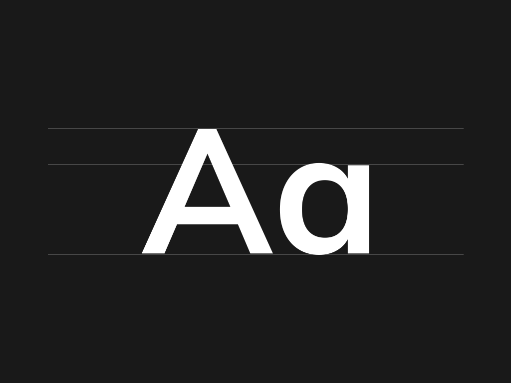
When we talk about the basics of typography, we cannot ignore the understanding of typefaces. Yes, you read that right. They are the foundation of typography. It means that when you want to design a craft, it is essential to select one of those typefaces that display in your typography project. Read on to know more.
There are primarily five classifications of typefaces, and they are serif, sans serif, script, monospaced, and display. Typically, serif and sans serif typefaces can be used for body copy or headlines that include titles and logos. You can use script and display typefaces only for headlines and monospaced for displaying code. Monospaced typefaces can also be used for body and headline copy, and people originally used them on typewriters.
History
In the 1400s, the typefaces were called blackletter, and they are the oldest ones. Also, they were known to resemble handwritten calligraphy.
Serif Typefaces
Serif typefaces emerged in the 1500s after blackletter. They include small projections that give the final finishing strokes. As a result, these typefaces came to be known as serifs. They are also called Old Style Serifs. Additionally, this style includes Garamond and Goudy Old Style.
Transitional Serifs
Transitional serifs are known to be the successors of the Old-Style serifs, and they appeared in the 1700s. They had high-stroke contrast and were more upright than their Old-Style predecessors.
The characteristic advancement of the patterns, present in Transitional serif typefaces got known as the Modern serifs during the 1800s. These Modern serifs incorporate text styles like Didot and Bodoni. They have outrageous differences among strokes and no sections on their serifs.
Slab Serifs
Slab serifs are the last advancement of the serif style. With the approach of automation (e.g the Steam Press, 1814), and other significant innovations in printing technology, just as another wave in publicizing with promoters going after an intense kind that truly affirmed its quality, they were structured to some degree to withstand considerably more modern printing forms.
They have little differentiation among strokes and most are unbracketed. Slab serif typefaces incorporate Rockwell and Clarendon, among others. They’re frequently thought of as typewriter text styles yet were utilized considerably more widely all through the twentieth century.
Grotesque Sans Serif
While serifs were the primary typefaces to develop after the first blackletters, sans serif typefaces to a great extent made advances on the design platform in the early century. These early sans serif typefaces were called grotesque or gothic fonts and included typefaces like Franklin Gothic. They were classified as ‘grotesque’ because of their dismissal of the ‘richer’ serif plan components.
Later during the 1900s, the Grotesques came to the Neo-Grotesque sans serif typefaces. These typefaces were intended to be more readable than their previous partners and for the more modest designs. Helvetica and Arial are the two instances of Neo-Grotesque sans serifs.
Geometric Sans Serif
Balancing the sans serif typefaces are the Geometric and Humanistic styles. Geometric sans serifs, similar to the Modern serifs, took the style to the edge. They have letterforms dependent on single geometric shapes, most strikingly the round ‘O’ shapes, and are modern. Their ultra-modern shapes do forfeit readability at smaller sizes. Futura is the most remarkable Geometric sans serif.
Humanistic Sans Serifs
Humanistic sans serifs tried to hold a portion of the impact that natural handwriting had on the letterforms of earlier typefaces. The letterforms are made increasingly available through characteristics like variable stroke widths. Gill Sans is one of the more well-known sans serif typefaces.
Other typeface styles; content and show are more difficult to organize along a timeline. Blackletter is a content typeface, while new scripts are being built up constantly. It is similar for display fonts, as they have been around nearly as long as versatile sort itself.
Now our UI UX Design Agency providing web design & web development services at nearest your location.
- UI/UX Agency in Mercer Island
- UI/UX Agency in Seattle
- UI/UX Design Agency in Redmond
- UI/UX Design Agency in Bellevue
- UI/UX Design Agency in Woodinville
- UI/UX Design Agency in Bothell
- UI/UX Design Agency in Sammamish
Handwriting
Handwriting scripts are primarily classified into casual and mimic modern handwriting. Examples include Blog Script, Pacifico, and Cedarville Cursive.
Monospaced
Monospaced typefaces are considered non-proportional, as every letter up the equal amount of horizontal space on the page or screen. Examples can include Courier New, Consolas, and Source Code Pro.
Display Typefaces
These typefaces vary majorly in their appearance. They include both practical and novelty fonts suitable for headlines and titles. Examples of these typefaces include Broadway, Cooper Black, and Curlz.
Formal
Formal scripts are categorized into:
1. Flowing loops and flourishes
2. Letterforms that are connected. Examples of these typefaces can include Bickham Script, Snell Roundhand, and Kuenstler Script.
Casual
Casual scripts have brush-like appearance with stronger strokes. Additionally, they have letterforms, which are at times connected. Examples include Brush Script, Bianca, and Mahogany Script.
Last Words
While the timespans in which they were planned can go far toward assisting with recognizing various typefaces. Many styles can extract different emotions in a project such as formal or casual, traditional or modern, and so on. Therefore, to know the particular attributes that set these styles apart from each other is significant information for a UX designer.
The above classification and explanation of various typefaces make it clear and easier for designers to select the most appropriate one for their designing project.