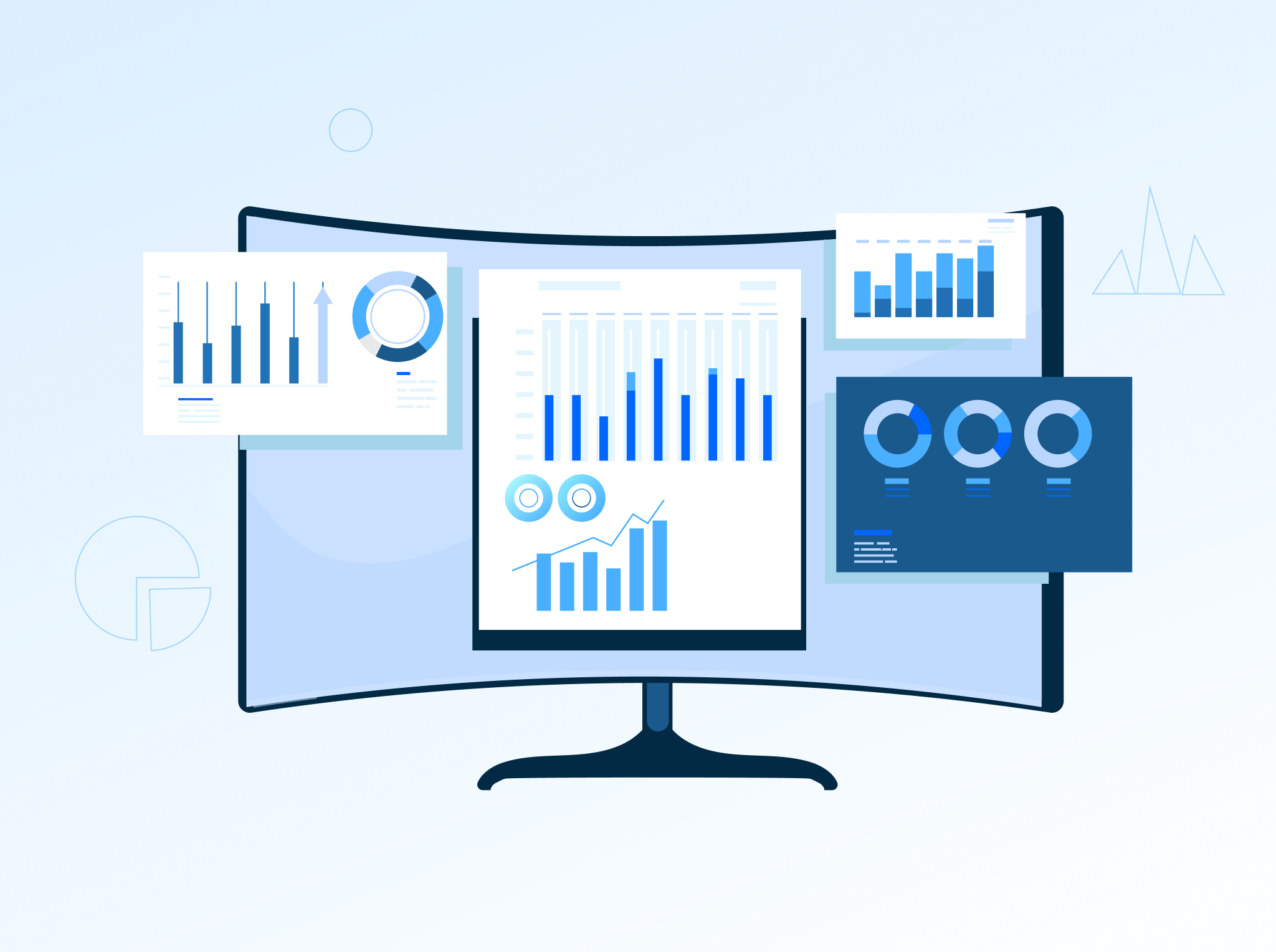
The significance of quality UI/UX design is soaring- not just for B2C but also for B2B websites. Both the B2C and B2B companies have realized that a good UX plays a crucial role in boosting customer engagement, royalty, and sales. However, there are several common UX mistakes that the B2B and B2C tend to make quite often on their sites. And that applies to the manufacturers from every spectrum: heavy and automotive machinery to construction, electronics, beverage, and food.
In this blog, we have listed common UI/UX design mistakes that need to be avoided on sites, along with solutions for fixing them.
Seeking a closure right away:

A major issue most websites tend to make is seeking a closure straight away. Asking a potential customer for contact details before they get the chance to know more about your product/service is a big turn-off. That is especially true in the present era of information, wherein a person’s name and email id are coveted. But the fact is that most B2B and B2C websites offer high-value items that need a lot of consideration and thought before making the purchase decision.
Solution:
Instead of immediately seeking closure, manufacturer websites should tell a story that captures the attention of potential customers and helps them understand the value of their product or service. A clear call-to-action should be prominently placed to encourage users to take the next step, such as ‘Learn More’ or ‘Read Our Blogs.’ A well-designed B2B or B2C website effectively guides its leads through the sales funnel, a process that may be lengthy but ultimately rewarding.
Not offering an effective product search:

The product search feature on a website helps the user to head to what they’re looking for directly instead of browsing through each filter or category, which in turn improves the user experience and makes it more efficient.
However, many website searches are not user-friendly. They often require the correct spelling of a product rather than allowing for common contextual queries like ‘new variant of XYZ’ or ‘replacement spare part for ABC.’ This forces customers to know the precise product spelling, which can be a source of frustration.
Solution:
Both B2C and B2B websites must use an effectual auto-suggest so that a user can look for a product/service with ease. Make the product search process as ‘human’ as possible. Nowadays, people are habituated to using search engines to find answers to their queries. So, look for relevant keywords and offer suggestions in a dropdown menu if the exact match isn’t found. Remove dead ends.
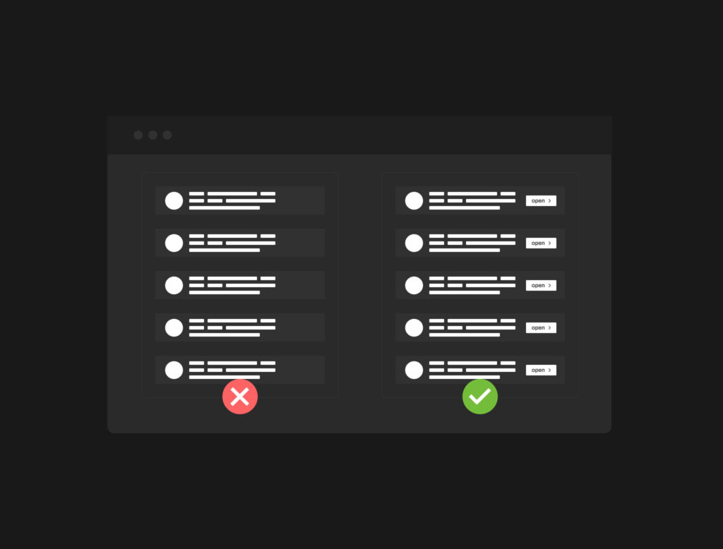
Displaying irrelevant search results:

The other most common UI/UX mistake on B2B and B2C websites occurs when users enter their search phrase in the search box. Ideally, the search results are a hotchpotch of press releases, blogs, articles, website pages, products, etc. This hotchpotch is displayed as a big list to the user, without any proper classification or chance of filtering the barely relevant results. That confuses the users as they don’t know which link they should click on to get the information they are looking for.
Solution:
Allow filtering or sorting through the results by category so that a user can only tap on, for instance, the ‘products’ option, thus hiding blogs, articles, documentation, and web pages.
Making it difficult to locate the product spec sheets:

The fourth common mistake that most sites commit is making it difficult for users to locate the product spec sheet. When users finally locate the product they are looking for, they’re often unsure if it is the correct product and check out its specifications to know it better. However, most manufacturers hide significant product technical information and make it difficult to find.
Solution:
Organize the product’s technical details in easy-to-read tabs and tables. Avoid uploading a 50-page long PDF for the complete product line as that will make significant product details even more challenging to find.
Friction to requesting information or purchasing:

So, what’s the next step after the user locates and confirms the product? B2B and B2C owners often depend on their distribution network for selling their products. However, connecting the buyers with the distributors is precisely where most B2B and B2C websites fail. Hence, the next reasonable step here is to guide the user in buying the product. Whether it’s requesting further information or connecting them to the distributor or store, the entire experience should be seamless.
However, this is not the situation with many B2B and B2C websites. Some websites only allow users to inquire about one product at a time, requiring them to retype or reenter redundant information, or to determine the department they need to contact themselves.
Solution:
Don’t make requesting details about a particular product too difficult for the users. Lessen the number of details you collect on the customer inquiry form. Forward the customer’s request to the distributor or sales representative directly.
Trouble in locating a distributor:

If a B2B and B2C owner has partnered with multiple distributors or dealers, having one locator that shows locations nearby a customer is significant. That is a very common friction factor. These days, many distributors or dealer locators need multiple steps and clicks, asking for repetitive details and offering confusing or inaccurate information.
Creating a good locator requires attention to minute details and careful consideration. Otherwise, your customers will be lost on your website and may not be able to place an order.
Solution:
A great approach here will be to detect the user’s geolocation automatically (either via the IP address or GPS) and recommend the closest distributor location while offering the user all the necessary information as well (including help in case they can’t locate a distributor within their locality).
Lack of mobile optimization:

As most people prefer to shop online through their mobile devices nowadays, it is crucial to have your website mobile optimized. You must test your UX on various kinds of tablets and mobile phones. People purchase differently on a desktop than on a mobile device. A small screen size limits the space for images, buttons, and content. A poor mobile design either contains extremely tricky and small-to-click elements or very big elements that make it difficult to navigate the site, which, in turn, hampers the UX and reduces conversions.
Solution:
Start by reviewing the product images on your website to ensure they are clear and sharp on all mobile devices. They should not appear distorted or stretched. Additionally, check the buttons to confirm they are easily visible and accessible on different screen sizes. Use large, boldly colored buttons on your webpage to make them prominent.
It is also important to keep track of your checkout process. Ensure that your customers can fill in the address field and other necessary details easily from any mobile device.
Getting started with enhancing the UX of your B2B or B2C website
A well-planned and designed B2C or B2B site should lead you towards your goals. There shouldn’t be any friction, obstacles or dead-ends. If you have never witnessed an actual customer interact with your site, you might be losing out on some serious business. So, make sure that you avoid the UI/UX design mistakes mentioned above while you work towards increasing your site’s online standing and sales.