The human race is always progressing, and so are its commercial activities. The internet made the world a village where you can carry out your commercial activities, including trade means of electronic commerce or eCommerce. We have expanded the reach of our businesses from local to global by means of the digital transformation process.
Everything changed on the web: data management, advertisement, sales channels, and presentation of products and services. To enable an end-to-end eCommerce buying process, we need to take care of full-cycle eCommerce operations, such as payments, delivery, and refund.
Designing Ecommerce UX
Designing an eCommerce user experience means:
- Thoroughly thought-out logic and transitions
- Simple yet clear micro-interactions
- Rapid feedback from the system
- Alluring product presentation
- Easy payment flow
The success of eCommerce UX design hinges on the user journey. By meticulously crafting each step of the user flow from a UX standpoint, we can encourage more impulse buys, reduce cart abandonment, and increase the conversion rate. Let’s explore how we can enhance each stage of the user journey with optimal UX.
User Journey
- Website Discovery or Landing Page Discovery
- Product Discovery
- Product Page
- Shopping Cart
- Checkout Process
- Payment Confirmation

1. Website Discovery or Landing Page Discovery:
How users find the website is out of discussion topic here. Once the user discovers the website, what happens is more meaningful in crafting the user experience.
When a user sees the website or its landing page for the first time, she quickly gets the impression of it. Experts say it is only 50 milliseconds to make up one mind. In such a short span, we have to show one or two essential things, and those are: what the website sells and where it is befitting in the present market.
Source: Glow
Intro Phase
To accomplish these jobs, UX designers have great tools, visual content, and styling of textual content accompanied by visual content. In other words, stunning photography of your products or services conveys the first message of what the website sells.
Concise and appealing textual content, combined with an appropriate background, careful font selection, and a refined color palette, helps to position products effectively in the current market.
Once the introduction phase is accomplished, it is time to push your website users or prospective shoppers into the engagement phase. Again, an effective CTA can do this job.
Crafting UX
The next important thing is crafting the landing pages to meet the users’ requirements. You will care about relevant keywords and the best user experience, from SERPs snippets to the presence of applicable products. Most users come with a buying intention, and you must show that whatever they are searching for is present here.
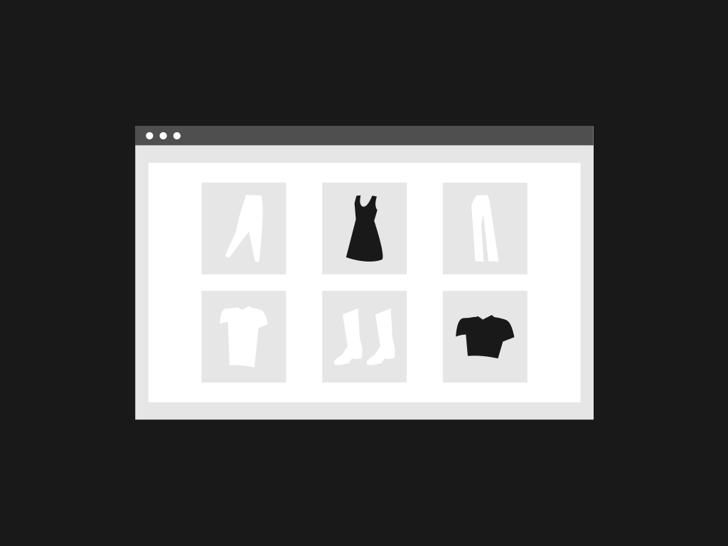
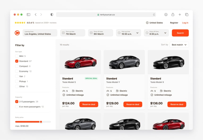
2. Product Discovery:
There are multiple ways to ease product discovery. For instance, lists of featured products, latest products, and, most importantly, an in-site product search facility.
Today, we have an advanced search engine to install on your eCommerce store and provide a quick and easy product-finding experience. Instant examples are:
- Faceted search,
- Filtered search,
- Auto-complete,
- Predictive search,
- Different navigation schemes like the main menu,
- Product categories & sub-categories lists in the sidebar, etc.
Source: Diana Palavandishvili
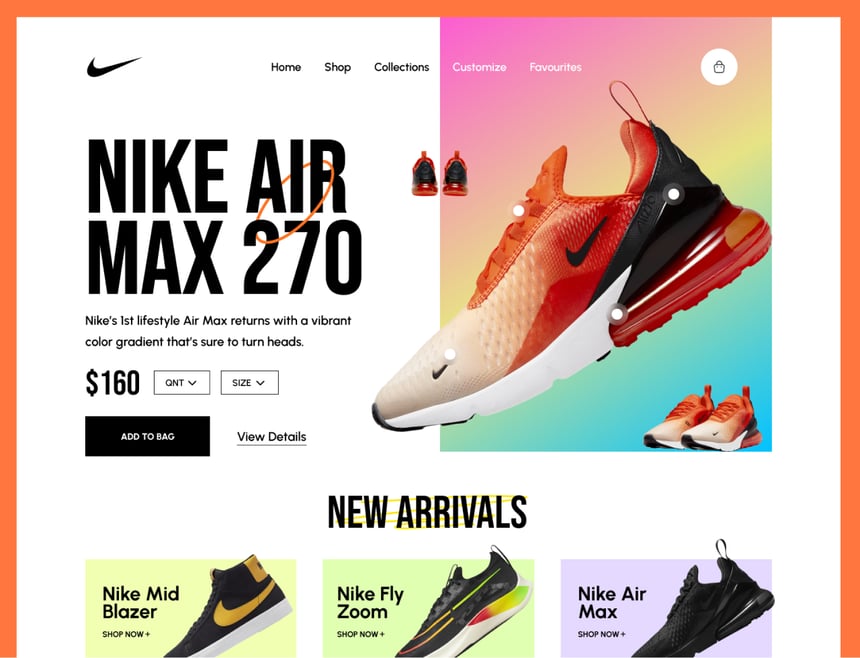
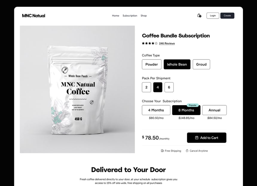
3. Product Page
CTA on Product Page
The next step in the user journey is landing on product pages. As usual, CTA is important here, and it must be prominent in graphics and texts both ways. Leave adequate white spaces around the “Add to Cart” button and select a color that highlights it among the other UI elements.
Placement is crucial, and designers often favor positioning it right below the concise product description, adjacent to the product images. Short descriptions provide essential information at a glance, while longer descriptions delve deeper, creating an information hierarchy.
Content Scanning
Breaking long descriptions into sections and displaying those in different tabs make sense in terms of UX. Tab titles offer the opportunity to scan content and save time. Of course, you can use accordions or another technique instead of tabs to make it more mobile-friendly.
Breaking Uncertainty
In most cases, eCommerce shoppers guess about product options, product availability, shipping policies, and product return policies and fall into the trap of uncertainty. You can break uncertainty and push shoppers ahead in their buying journey by providing such required info on the product page.
Social Proof to Build Trust
We can add customer reviews, ratings, and read comments by allowing them to do so or bring those things right from rating and review sites. According to principles of persuasion, social proofs build trust among the shoppers, and they become excited to buy your products or services with positive attitudes.
Source: DStudio®
4. Shopping Cart
Show Order Summary Upfront
Eliminate the incidents of shipping charges surprise by giving an order summary before the buyer finishes her shopping. For example, display the purchased quantity, costs of each item, and the order total. Moreover, keep things editable in the shopping cart. So, buyers should have the freedom to add or remove items and adjust their budgets.
Further showing receipt and order summary makes sense, as buyers can see shipping and taxes.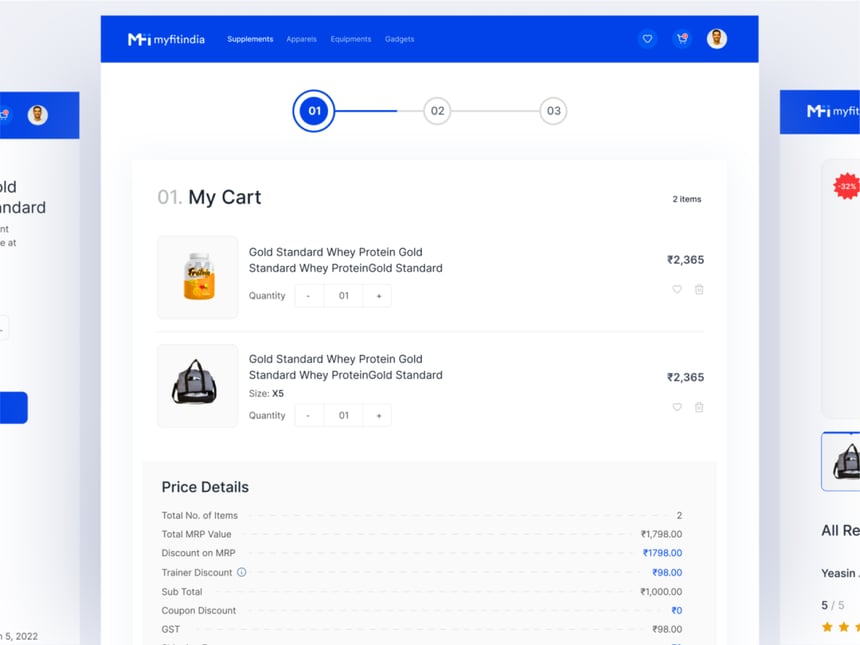
Source: Rakibull Hassan
5. Checkout Process
Allow Checkout as Guests
The account registration process is a hassle on the road of impulse purchase. So, allow checkout as guests and let shoppers accomplish their buying process as soon as possible. There are many ways to convert those guests into account users later on.
Use Progress Bar
The checkout process is crucial, and providing visual feedback informs users of their current status and the subsequent steps. Additionally, it is essential to save progress to prevent any potential issues during the checkout process.
Use Regionally Favorite Payment Methods
It is true that most people prefer common payment methods as well as many regionally famous payment gateways. So keep provision for that and never give users any chance to abundant the cart.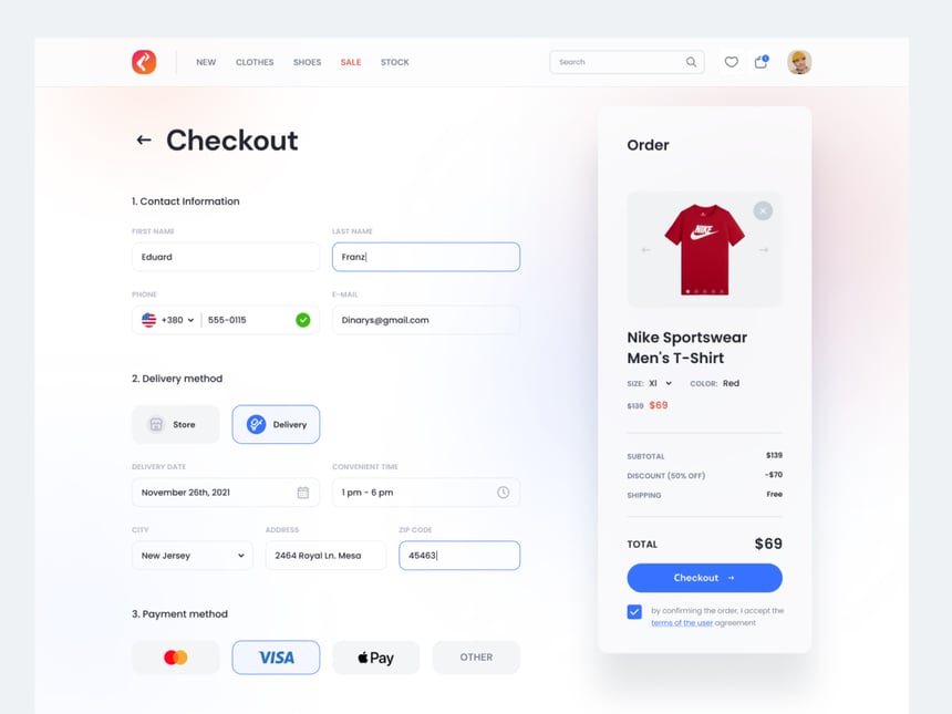
Source: Igor
6. Payment Confirmation:
Displaying an order confirmation message is a known formality in eCommerce. So you can grab that chance to show additional info and announcements—for instance, delivery details, such as date, methods, and address.
Confirmation Email
You can send a confirmation email after displaying the confirmation message and give them the tracking number and links to track the order on your site using tacking software facilities.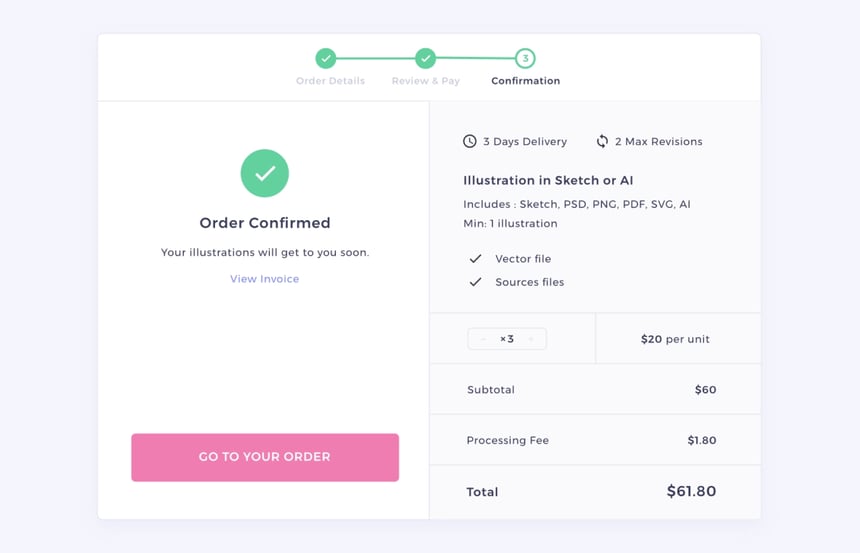
Source: Charles Marino
Summary:
We have seen that each step of the user journey offers an opportunity to enhance the user experience. We can infuse strategies and principles of UX right from the discovery phases. For example, removing hurdles and ease in finding the right product can speed up the buying process. The same goes for the rest of users’ purchase journey: best UX on product pages, editable shopping cart, well-informed checkout process, and confirmation of successful buying boost the chances of speedy conversion and high ROI by gaining repeat customers.
Now quest is who will craft the UX of your eCommerce? First, of course, you need an experienced and expert team of UX designers who have successfully created awesome user experiences for many other eCommerce stores, and it is RP UXCollab.
The team at RP UXCollab is waiting for your call or quick contact. Talk to them about your requirements and get the best UX infused with your eCommerce storefront.