Software as a Service (SaaS) is a dominant and competitive business model in today’s digital landscape. Widely-used SaaS offerings such as Office 365 and Google Apps have integrated into nearly every aspect of our lives. Therefore, it’s fair to say that SaaS products are central to the modern world.
However, what exactly happens when a SaaS product’s UI/UX design isn’t good and has errors? When these errors aren’t corrected, the users will eventually forget the product. There’s simply no space for an erroneous or bad UI/UX in such kind of a marketplace.
As design creates the first impression, developing quality UX design for a SaaS product is imperative. The user will not likely visit the SaaS product if its UX fails. And without a target audience, the entire process of building the SaaS product will be pointless.
Hence, in this blog, we will discuss the 13 worst UX design mistakes or failures and how you can avoid them.
Excess technical jargon usage:
Source: Userpilot
Even when your SaaS product is aimed at business professionals, it’s important to minimize the use of excessive technical jargon. This is because, first, too much jargon can disengage your users, and second, it’s not always accurate to assume that your target audience possesses advanced technical knowledge.
Solution: To build a good UX design, you need to consider that the target audience has minimum knowledge of technical terms and avoid excessive technical jargon usage.
Poorly designed onboarding process:
Source: Appcues
A poorly designed onboarding process for a SaaS product can lead to higher churn rates. A positive onboarding experience is crucial for retaining users over time. If users don’t receive the support they need, they are likely to cancel their subscriptions.
Solution: A good UI/UX design provides a well-designed onboarding process, which, in turn, helps your SaaS product to offer a user-friendly and clean environment to users. Resultantly, the users get the right UX experience and adapt your SaaS product easily.
Concentrating on just features and forgetting about benefits:
Source: nexterwp
The real worth of a SaaS product lies not only in its features but also in the benefits it provides. Focusing solely on features without highlighting these benefits does not enhance the product’s value. Overemphasizing features without addressing the essential user question, ‘What benefits will this product offer me?’ is ineffective.
Solution: To create a good and attractive UX design, it’s imperative to maintain a proper balance between your SaaS product’s benefits and technical features. While mentioning your SaaS product, your content must include its benefits to the users.
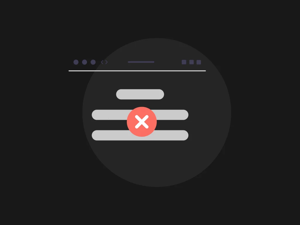
Complex interface:
Source: setproduct
In today’s fast-paced world, individuals seek quick and seamless solutions. Opening multiple tabs or spending excessive time on product registration is often frustrating. Users expect a SaaS product to offer a straightforward UI/UX.
Solution: Make sure that your SaaS product is as simple and easy to use as possible. Focus on creating a robust experience for your users. That way, the users will spend the least possible effort to use your product and attain their goals from the product.
Not prioritizing the users:
Source: Wix
The success of a SaaS product entirely depends on its users. With the expectations/needs of the users changing with time, the UI/UX design of your product must also adapt to those changes optimally. Moreover, the users are an incredible source of true feedback. If you avoid the user feedback, you will also ignore the user’s needs or demands. Resultantly, you will miss out on a major segment of your SaaS product’s audience.
Solution: You have to prioritize your users in every situation. Create an environment that matches the preferences and needs of your users. Additionally, you should also conduct thorough research, run re-iterations whenever required, and listen to the users’ feedback.
No White Space:
Source: Themeforest
Using a lot of text and features may be overwhelming to the users. Ample breathing space is required to display interactive features. Using all the screen space to showcase each feature will boost the bounce rates and make the SaaS product overly complicated.
Solution: It’s important to use the best UI/UX design practices rather than displaying everything about your product on one screen. Build lesser product features instead of using too many features and creating a bad UX.
Persistent demo content:

The demo content is incredible to show your customers what your product will look like right after they provide a little info about themselves. However, sometimes, demo content does not disappear even after the trial, which can be frustrating and confusing for users. That’s neither a sign of a quality UX design nor a good product experience.
Solution: You must ensure that the demo content vanishes after it has served its purpose. When demo content is used correctly, it should disappear after the customer replaces it with real user information. Whether to use or not to use the product then will be at the users’ discretion.
Autoplay videos:
Source: nexterwp
Video content, by nature, is very engaging and attractive, which is likely why many SaaS companies are including autoplay videos to direct customers to something that interests them. However, this can also pose an issue if you use the video content’s engaging nature to draw users to something irrelevant.
Solution: Injecting autoplay videos can invite your audience to know more about your product, but the absence of great content or autonomy can lead to a few tuning out. Therefore, it’s recommended that you incorporate autoplay videos by understanding your audience and knowing their needs. By allowing more control for the users to pick and choose how they can interact with the autoplay video, you will be able to tailor the autoplay experience as per their needs.
Too many push notifications:
Source: optinmonster
Push notifications are effective for engaging users and encouraging repeat visits. However, receiving an excessive number of notifications in a short period can be overwhelming. An overload of push notifications may annoy users and lead to an increased churn rate.
Solution: You should monitor the frequency of the push notifications. The number of messages you send should be consistent and the same each day of the week- not too many and not too few. A SaaS product whose UX design does not overdo with push notifications leaves a good image before the users, getting them to use the product.
Long dropdown menu:
Source: userpilot
A dropdown menu with a big wall of text does not spark customer loyalty. Long dropdown menus require a lot of scrolling, which makes it impossible for the users to explore all the choices in just a glance. This issue is very common on a website that asks you to enter your nationality. Suppose you are from Spain and the website in question has a dropdown menu, then happy riffling through!
Solution: To offer a better user experience, it is best to skip out on the dropdown menu entirely and allow the users to write what they’re expected to fill in. However, if you wish to use automation, you can try the autocomplete feature.
Unbalanced functionality and aesthetics:
Source: tdfall
A SaaS product must maintain a proper balance between functionality and aesthetics. Prioritizing one over another is problematic. Excessive aesthetics overruns functionality and vice versa. When you compromise on either of them, you will reduce user experience quality.
Solution: A well-planned UX design maintains a proper balance between functionality and aesthetics of the SaaS product. A SaaS product with a good design builds an aesthetic surrounding for users while they also enjoy the functionality of the SaaS product. Hence, by maintaining a good balance between functionality and aesthetics, a good UI/UX design offers a lasting and positive user experience.
Complicated password requirement:
Source: userpilot
Every business wants its customers to enter secure passwords to prevent the heinous act of hacking. So, a little caution is reasonable here. However, this sometimes goes way a little too far.
Let’s assume that an average user likely has several passwords already to remember. But if you place too many requirements for password creation, you will simply cause them stress. Additionally, they may not even remember the new 14 or 16-letter password with 5 special characters a few days later.
Solution: You need to maintain a balance here between ease-of-use and security. Instead of stressing out your users with many requirements for password creation, ease the process out by reducing a few of the technical restrictions.
Unresponsive design:
Source: dequeuniversity
Many SaaS products fail to cater to the basic norm of being easy and responsive on different platforms and screen sizes. Responsive design isn’t a mere trend; it is a crucial aspect of a successful SaaS product. It makes your content accessible across varied screen sizes regardless of platforms. One can’t access a website or application on a smartphone if it does not have a responsive structure.
Solution: Redesign your website or application and prioritize responsiveness to offer the most incredible user experience. That will further contribute to lower bounce rates, good customer feedback, better readability, increased conversions, and more.
Conclusion:
These are a few of the worst UI/UX design fails you need to avoid in your SaaS. The main function of a SaaS product is to communicate well with its target audience and not confuse them. If you still need help in creating your SaaS product, you can consider hiring professionals to build a successful SaaS product without any errors.